Campaign Elements & Touchpoints
The campaign centers on three interconnected touchpoints designed to promote clean air awareness through creative, emotional, and participatory channels:
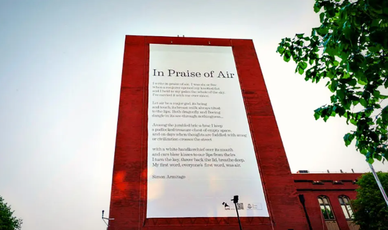
Physical Touchpoint: An animated billboard using kinetic typography, handcrafted visuals, and layered video imagery to contrast nature with pollution, creating a striking call to action.
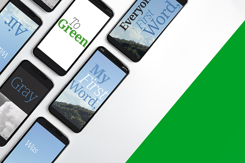
Digital Touchpoint: Two Instagram stories engaged audiences with dynamic text and relatable messages: one focused on collective impact through everyday choices, the other invited personal reflection with the prompt "What does clean air mean for you?" and the hashtag #ReclaimingBreath.
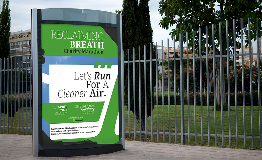
Non-Traditional Touchpoint: A charity marathon with Barnardo's, merging physical effort with advocacy. Participants supported the cause through their £5 entry fee, reinforcing the connection between childhood well-being and cleaner air.
Color Palette
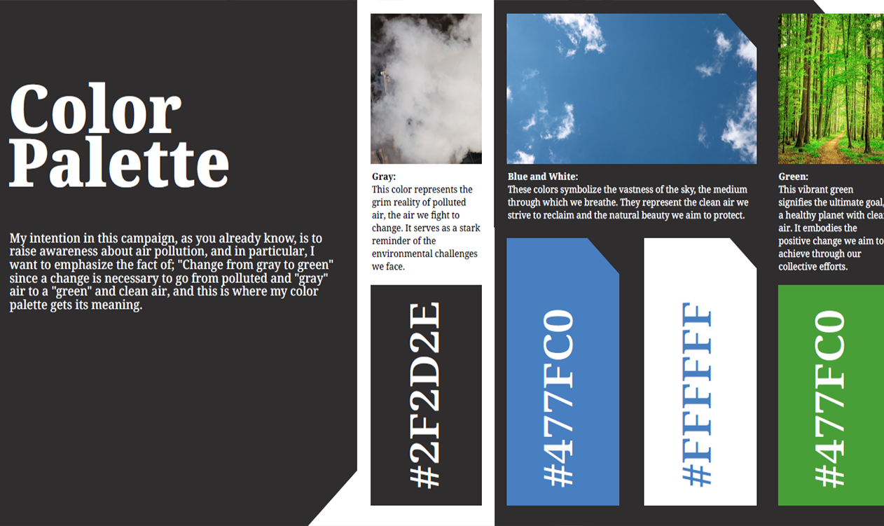
Our intention in this campaign is to raise awareness about air pollution by emphasizing a transformation: "Change from gray to green". This is where the color palette gains its meaning, visually representing the journey from pollution to clean air:
Gray (#2F2D2E): Embodies the grim reality of polluted air, serving as a stark reminder of the environmental challenges we aim to overcome.
Blue (#477FC0): Symbolizes the vastness of the sky and represents the clean air we strive to reclaim, along with the natural beauty we seek to protect.
White (#FFFFFF): Also symbolizes the vastness of the sky and clean air, reinforcing the theme of natural purity.
Green: This vibrant green signifies the ultimate goal: a healthy planet with clean air. It embodies the positive change sought through our collective efforts.